jmu x labs identity presentation
TRANSCRIPT
The Symbol for the Next Generation of
Inventors, Entrepreneurs and Collaborators
at James Madison University.
4 5
What should a logo for JMU X-Labs look like?
Well, there is a lot to be inspried by.
6 7
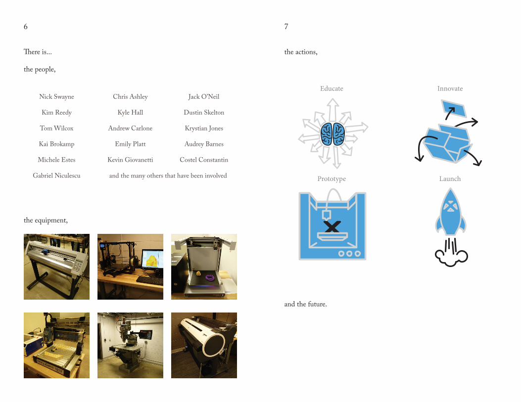
There is...
the people,
Nick Swayne
Kim Reedy
Tom Wilcox
Kai Brokamp
Michele Estes
Gabriel Niculescu
Chris Ashley
Kyle Hall
Andrew Carlone
Emily Platt
Kevin Giovanetti
Jack O’Neil
Dustin Skelton
Krystian Jones
Audrey Barnes
Costel Constantin
and the many others that have been involved
the equipment,
the actions,
Educate
Prototype
Innovate
Launch
and the future.
8 9
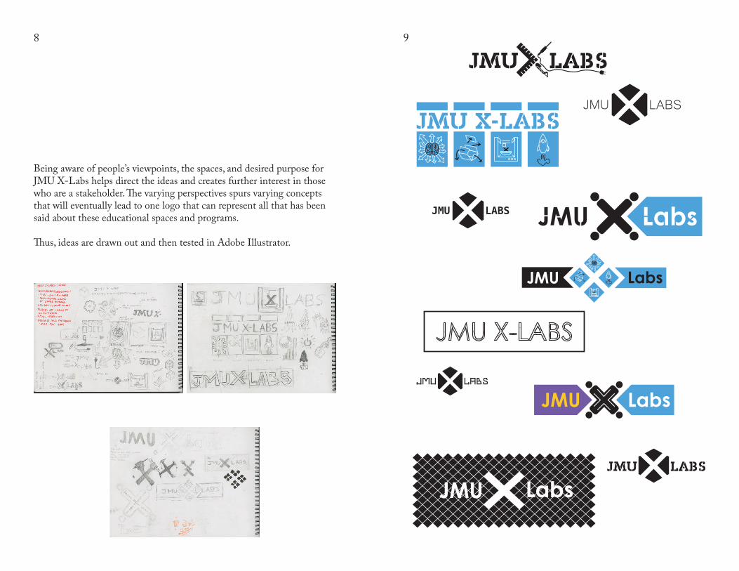
Being aware of people’s viewpoints, the spaces, and desired purpose for JMU X-Labs helps direct the ideas and creates further interest in those who are a stakeholder. The varying perspectives spurs varying concepts that will eventually lead to one logo that can represent all that has been said about these educational spaces and programs.
Thus, ideas are drawn out and then tested in Adobe Illustrator.
JMU LABS
Labs
LabsJMU
LabsJMU
JMU LABS Labs
10 11
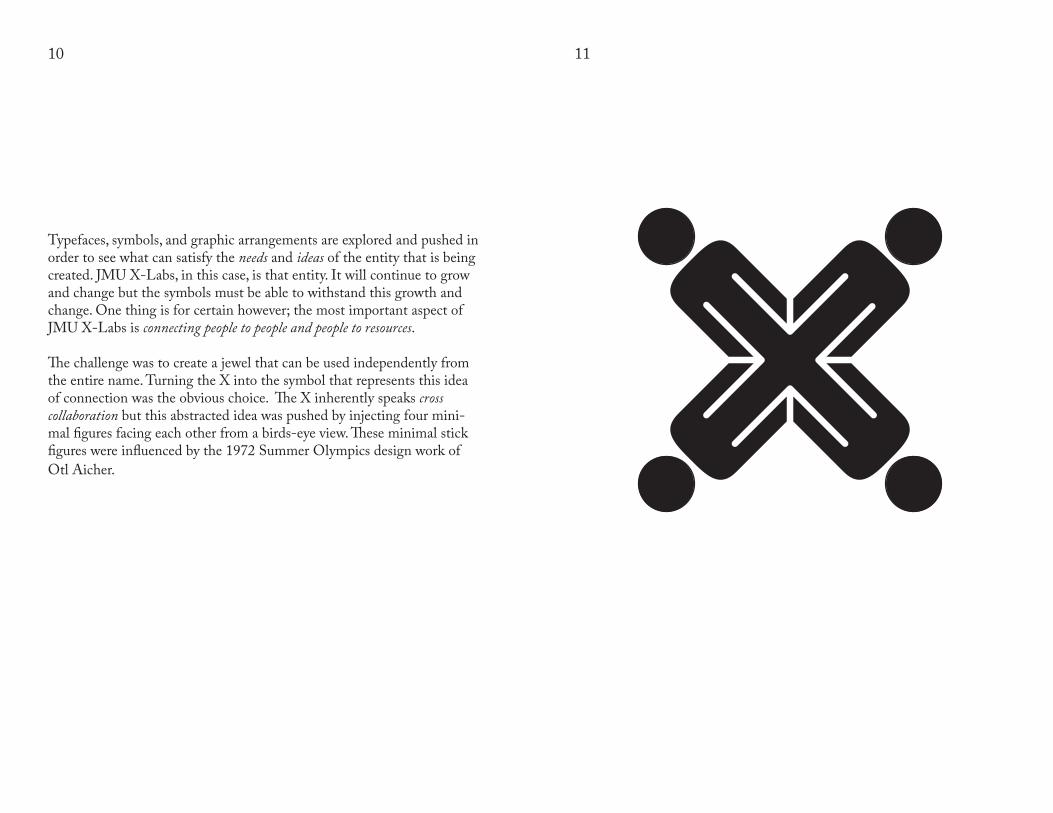
Typefaces, symbols, and graphic arrangements are explored and pushed in order to see what can satisfy the needs and ideas of the entity that is being created. JMU X-Labs, in this case, is that entity. It will continue to grow and change but the symbols must be able to withstand this growth and change. One thing is for certain however; the most important aspect of JMU X-Labs is connecting people to people and people to resources.
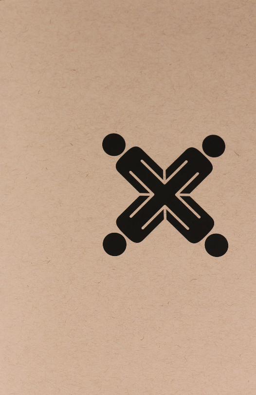
The challenge was to create a jewel that can be used independently from the entire name. Turning the X into the symbol that represents this idea of connection was the obvious choice. The X inherently speaks cross collaboration but this abstracted idea was pushed by injecting four mini-mal figures facing each other from a birds-eye view. These minimal stick figures were influenced by the 1972 Summer Olympics design work of Otl Aicher.
12 13
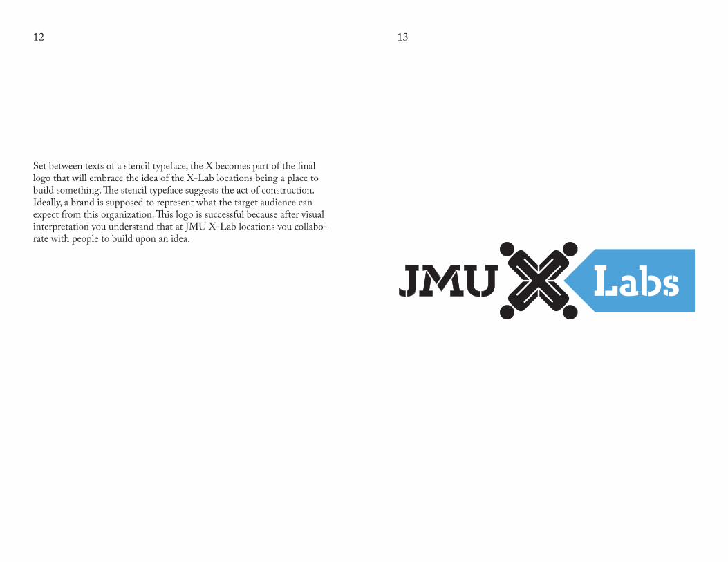
Set between texts of a stencil typeface, the X becomes part of the final logo that will embrace the idea of the X-Lab locations being a place to build something. The stencil typeface suggests the act of construction. Ideally, a brand is supposed to represent what the target audience can expect from this organization. This logo is successful because after visual interpretation you understand that at JMU X-Lab locations you collabo-rate with people to build upon an idea.
14 15
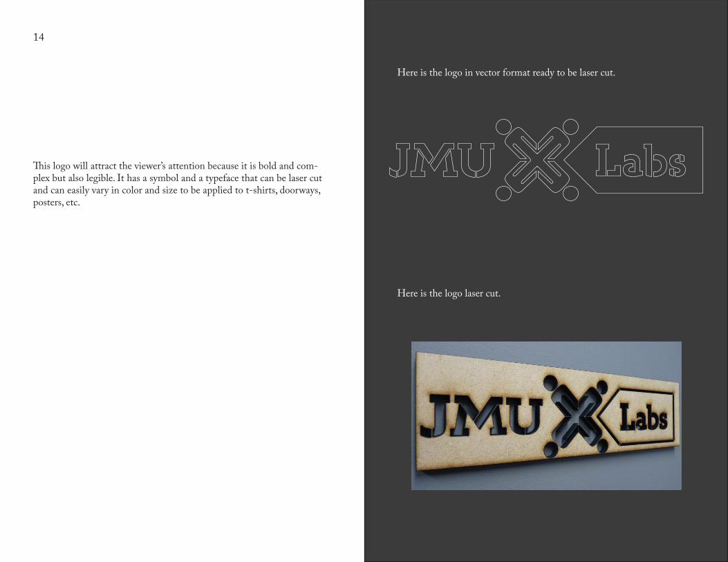
This logo will attract the viewer’s attention because it is bold and com-plex but also legible. It has a symbol and a typeface that can be laser cut and can easily vary in color and size to be applied to t-shirts, doorways, posters, etc.
Here is the logo in vector format ready to be laser cut.
Here is the logo laser cut.
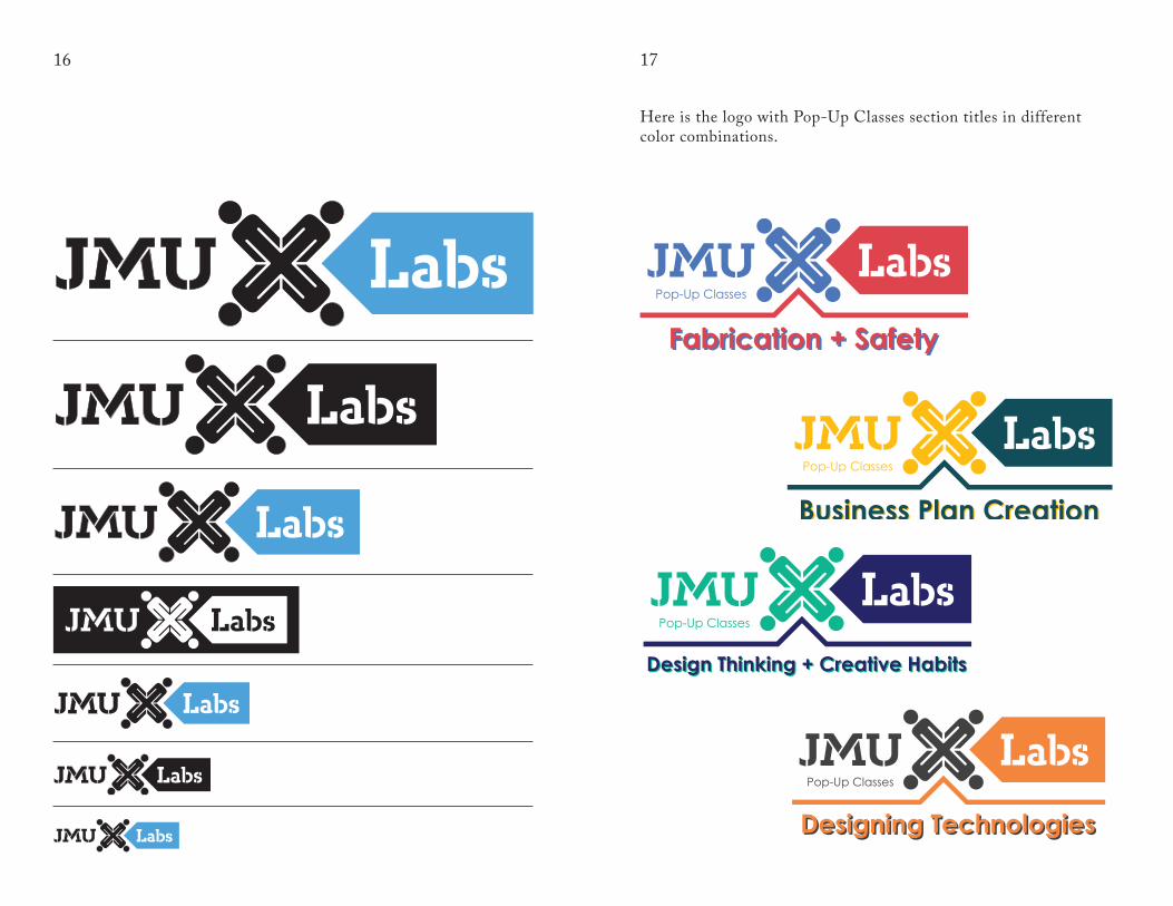
16 17
Here is the logo with Pop-Up Classes section titles in different color combinations.
Pop-Up Classes
Fabrication + SafetyFabrication + Safety
Pop-Up Classes
Design Thinking + Creative HabitsDesign Thinking + Creative Habits
Business Plan Creation
Pop-Up Classes
Business Plan Creation
Pop-Up Classes
Designing TechnologiesDesigning Technologies
18
Timothy MooreHarrisonburg, VirginiaSummer 2015