sas graph template language (gtl)超入門...• そこでgraph template...
TRANSCRIPT

SAS Graph Template Language
(GTL) 超入門
proc template + proc sgrender
舟尾 暢男
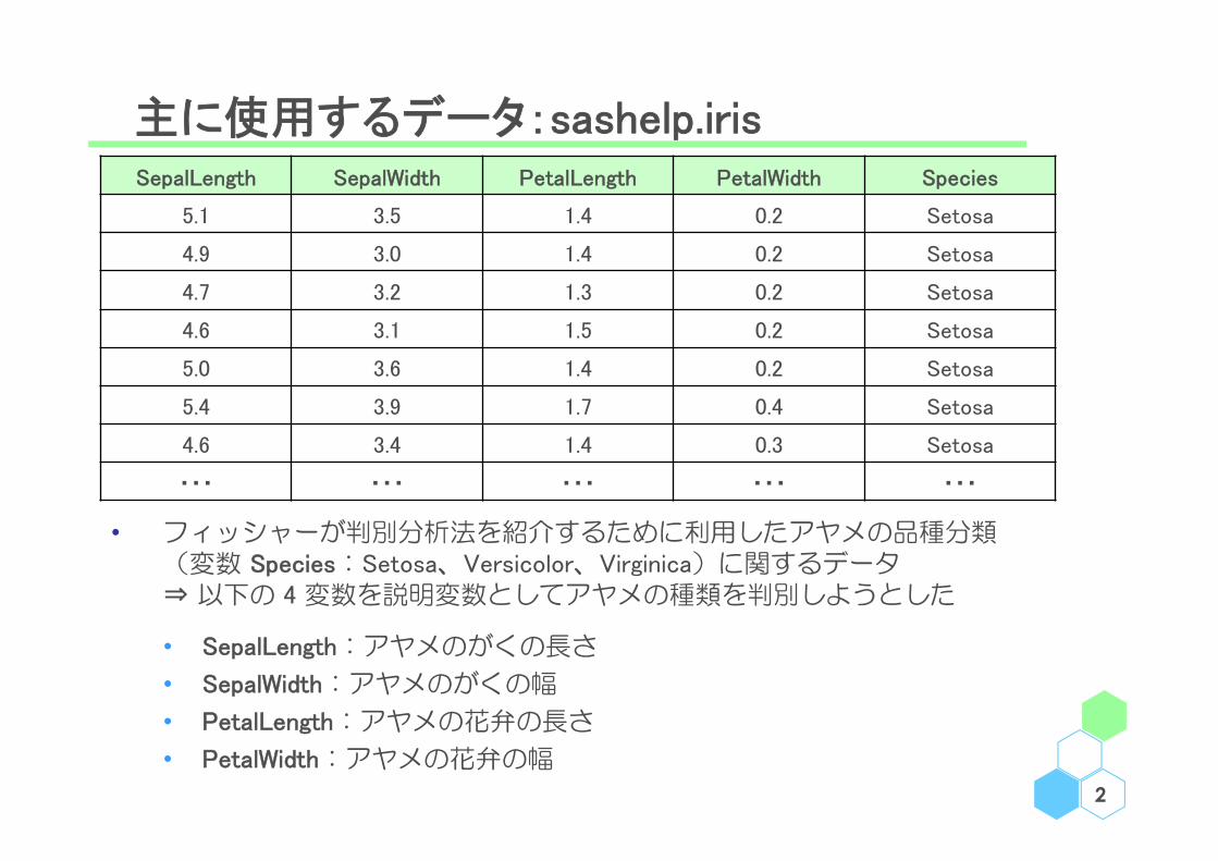
主に使用するデータ:sashelp.iris
2
SepalLength SepalWidth PetalLength PetalWidth Species
5.1 3.5 1.4 0.2 Setosa
4.9 3.0 1.4 0.2 Setosa
4.7 3.2 1.3 0.2 Setosa
4.6 3.1 1.5 0.2 Setosa
5.0 3.6 1.4 0.2 Setosa
5.4 3.9 1.7 0.4 Setosa
4.6 3.4 1.4 0.3 Setosa
・・・ ・・・ ・・・ ・・・ ・・・
• フィッシャーが判別分析法を紹介するために利用したアヤメの品種分類(変数 Species:Setosa、Versicolor、Virginica)に関するデータ⇒ 以下の 4 変数を説明変数としてアヤメの種類を判別しようとした
• SepalLength:アヤメのがくの長さ
• SepalWidth:アヤメのがくの幅
• PetalLength:アヤメの花弁の長さ
• PetalWidth:アヤメの花弁の幅

たまに使用するデータ:sashelp.bmt
3
• Klein and Moeschberger (1997) が生存時間解析の手法の紹介の際に用いた造血幹細胞移植(Bone Marrow Transplant)に関するデータ
• Group:群(ALL、AML-Low Risk、AML-High Risk)
• T:生存時間(日)
• Status:イベントに関する変数(1:イベント、0:打ち切り)
Klein, J. P. and Moeschberger, M. L. (1997) "Survival Analysis: Techniques for Censored and Truncated Data", Springer-Verlag.
Group T Status
ALL 2081 0
ALL 1602 0
ALL 1496 0
ALL 1462 0
ALL 1433 0
ALL 1377 0
ALL 1330 0
・・・ ・・・ ・・・

Menu
• 事始
• 各論
• 軸
• 凡例
• 色、線、点
• 文字追記
• 雑多
4
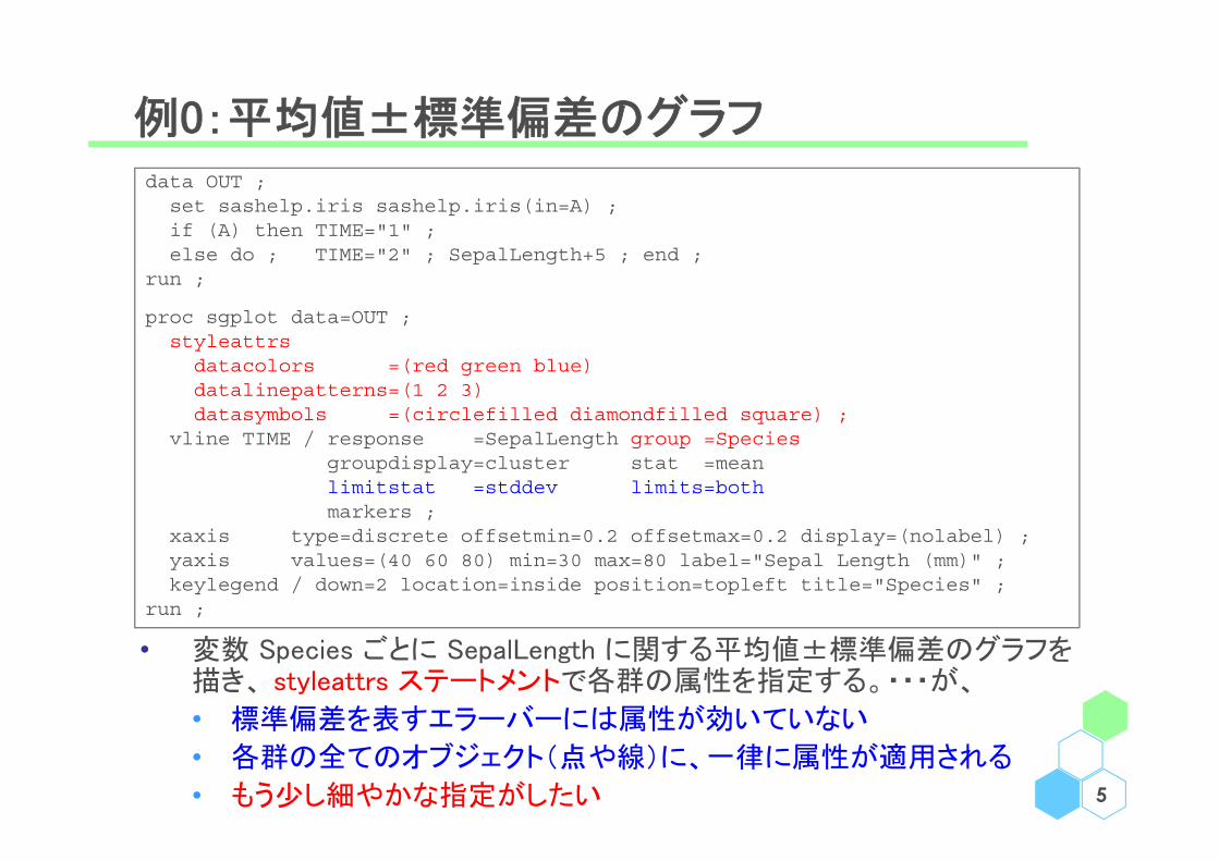
例0:平均値±標準偏差のグラフ
5
data OUT ;set sashelp.iris sashelp.iris(in=A) ;if (A) then TIME="1" ;else do ; TIME="2" ; SepalLength+5 ; end ;
run ;
proc sgplot data=OUT ;styleattrsdatacolors =(red green blue)datalinepatterns=(1 2 3)datasymbols =(circlefilled diamondfilled square) ;
vline TIME / response =SepalLength group =Speciesgroupdisplay=cluster stat =meanlimitstat =stddev limits=bothmarkers ;
xaxis type=discrete offsetmin=0.2 offsetmax=0.2 display=(nolabel) ;yaxis values=(40 60 80) min=30 max=80 label="Sepal Length (mm)" ; keylegend / down=2 location=inside position=topleft title="Species" ;
run ;
• 変数 Species ごとに SepalLength に関する平均値±標準偏差のグラフを描き、 styleattrs ステートメントで各群の属性を指定する。・・・が、
• 標準偏差を表すエラーバーには属性が効いていない
• 各群の全てのオブジェクト(点や線)に、一律に属性が適用される
• もう少し細やかな指定がしたい
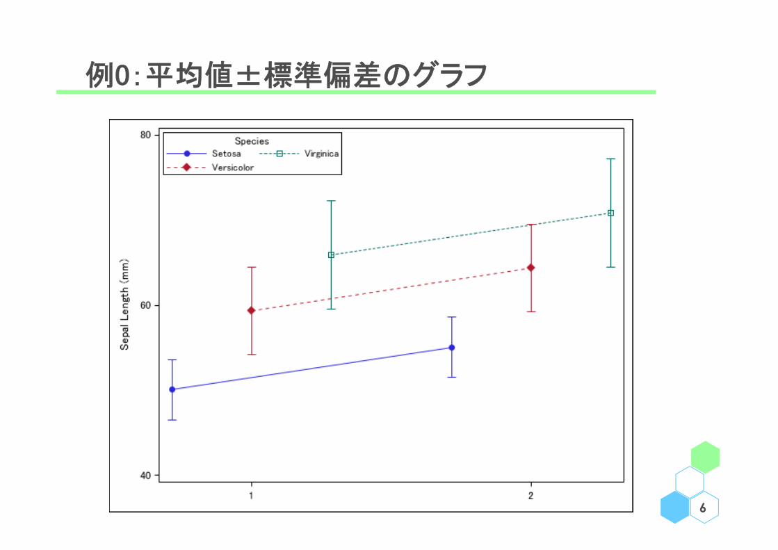
例0:平均値±標準偏差のグラフ
6
何故 Graph Template Language ???
• sgplot プロシジャや sgpanel プロシジャでサクッと綺麗なグラフが作成出来る
• 上記で満足のいくグラフが作成できる場合、GTL は不要
• 上記プロシジャだけではカスタマイズが困難な場合も
• 複数の群別のグラフ → 例えば前頁の場合
• 複数のグラフを描いた場合の凡例のカスタマイズ
• sgplot プロシジャのマニュアルではオプションが存在するのに実際に指定してみると有効にならない
• そこで Graph Template Language(GTL)を使用する
1. proc template でグラフの詳細を決める
2. proc sgrender でデータセットと #1 のテンプレートを指定し描画
7
例1:単純なグラフ
8
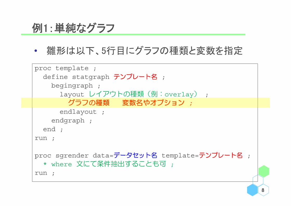
proc template ;define statgraph テンプレート名 ;
begingraph ;layout レイアウトの種類(例:overlay) ;
グラフの種類 変数名やオプション ;endlayout ;
endgraph ;end ;
run ;
proc sgrender data=データセット名 template=テンプレート名 ;* where 文にて条件抽出することも可 ;
run ;
• 雛形は以下、5行目にグラフの種類と変数を指定
例1:単純なグラフ①
9
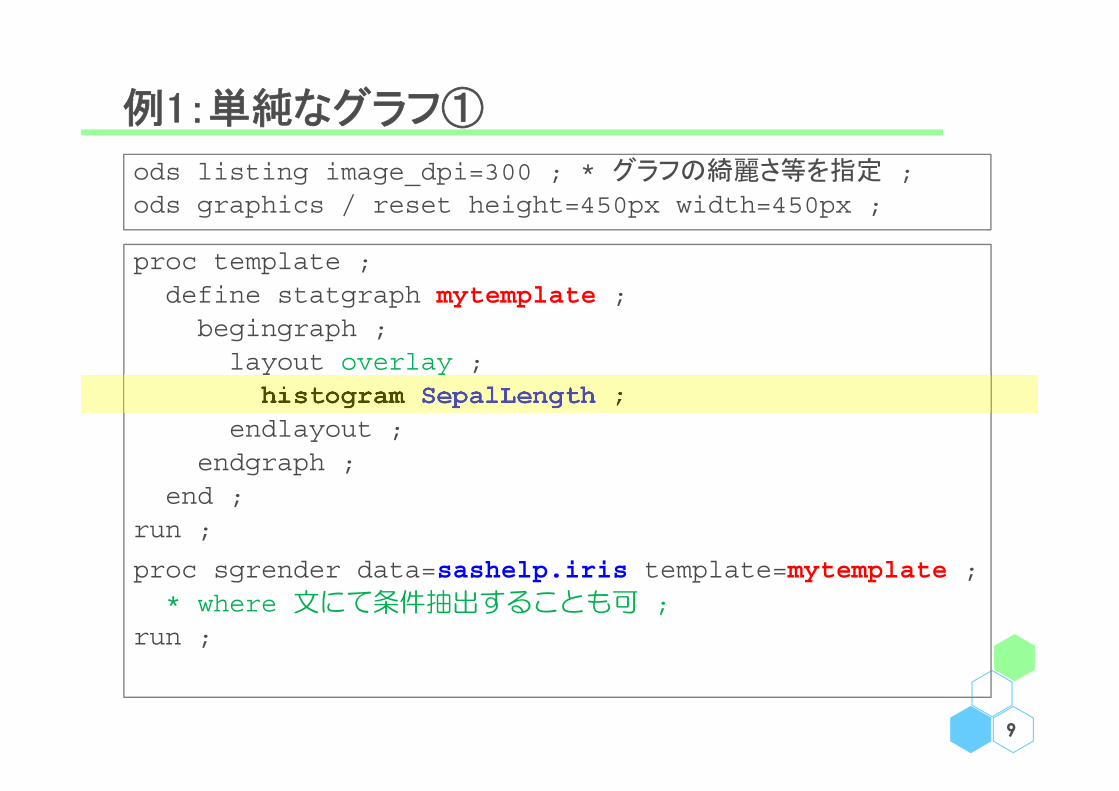
ods listing image_dpi=300 ; * グラフの綺麗さ等を指定 ;ods graphics / reset height=450px width=450px ;
proc template ;define statgraph mytemplate ;
begingraph ;layout overlay ;
histogram SepalLength ;endlayout ;
endgraph ;end ;
run ;
proc sgrender data=sashelp.iris template=mytemplate ;* where 文にて条件抽出することも可 ;
run ;

例1:単純なグラフ①
10
例1:単純なグラフ②
11
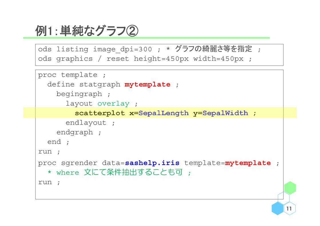
ods listing image_dpi=300 ; * グラフの綺麗さ等を指定 ;ods graphics / reset height=450px width=450px ;
proc template ;define statgraph mytemplate ;
begingraph ;layout overlay ;
scatterplot x=SepalLength y=SepalWidth ;endlayout ;
endgraph ;end ;
run ;
proc sgrender data=sashelp.iris template=mytemplate ;* where 文にて条件抽出することも可 ;
run ;
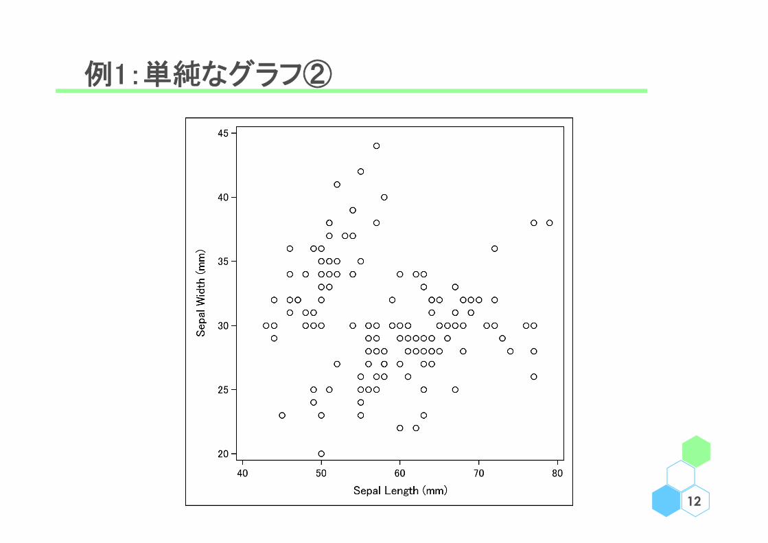
例1:単純なグラフ②
12

例2:平滑化曲線と Confidence Limit + 凡例
13
proc template ;define statgraph mytemplate ;begingraph ;layout overlay ;scatterplot x=SepalLength y=SepalWidth ;loessplot x=SepalLength y=SepalWidth/ name="fit" clm="clm" alpha=0.05 legendlabel="Loess" ;
modelband "clm" / name="cb" display=alllegendlabel="95% CLM" datatransparency=0.5 ;
discretelegend "fit" "cb" ;endlayout ;
endgraph ;end ;
run ;
proc sgrender data=sashelp.iris template=mytemplate ;run ;
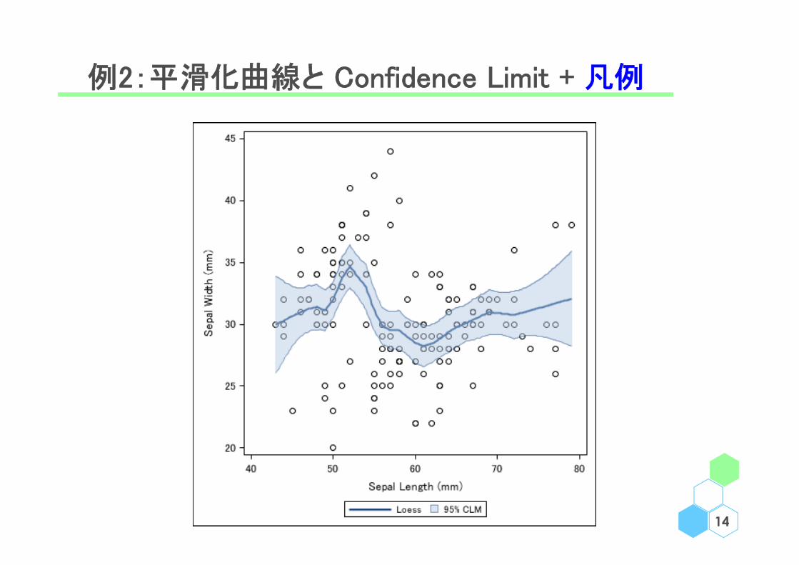
例2:平滑化曲線と Confidence Limit + 凡例
14

例3:複数のグラフ
15
proc template ;define statgraph mytemplate ;
begingraph ;entrytitle "Title" ; * entryfootnote も可 ;layout lattice / border=false rows=1 columns=2 ;layout overlay ;
histogram SepalLength / group=Species name="x" ;endlayout ;layout overlay ;
scatterplot x=SepalLength y=SepalWidth ;endlayout ;sidebar;
discretelegend "x" ;endsidebar;
endlayout;endgraph;
end;run;
ods graphics / height=450px width=600px ;proc sgrender data=sashelp.iris template=mytemplate ;run ;

例3:複数のグラフ
16

例4:Kaplan-Meier Plot
17
ods output Survivalplot=KM_DATA ;proc lifetest data=sashelp.bmt plots=survival(atrisk=0 to 2500 by 500);time T * Status(0) ; strata Group ;
proc format ;value STRF 1="All" 2="AML-High Risk" 3="AML-Low Risk" ; value DAYF 0="0" 500="1.5" 1000="3" 1500="4.5" 2000="6" 2500="7.5" ;
run ;
proc template ;define statgraph mytemplate ;begingraph / datacontrastcolors=(black red blue) datalinepatterns=(1 2 4);layout overlay ;stepplot x=Time y=Survival / group=StratumNum name="x" ;scatterplot x=Time y=Survival / group=StratumNum
markerattrs=(symbol=plus) ;innermargin ;blockplot x=tAtRisk block=AtRisk / class=StratumNum
display=(label values) ;endinnermargin ;discretelegend "x" ;
endlayout ;endgraph ;
end ;run ;
proc sgrender data=KM_DATA template=mytemplate ;format Time DAYF. StratumNum STRF. ;
run ;
※ フォーマットは sgrender にて指定

例4:Kaplan-Meier Plot
18
※ 資料 "Customizing the Kaplan-Meier Survival Plot" が良くまとまっているので、本資料では深追いしないhttps://support.sas.com/documentation/onlinedoc/stat/141/kaplan.pdfhttps://support.sas.com/documentation/onlinedoc/stat/151/kaplan.pdf

まとめ
1. layout overlay で個々のグラフの指定を行う
• グラフの種類は次頁
• 縦横のスケールを統一する layout overlayequated 等もあり
2. layout lattice で複数のグラフを描く準備を行う
• ■行●列、グラフを並べる順番など
3. ods listing でグラフの綺麗さ(dpi)を指定、
ods graphics / reset height=X px width=Y px で
グラフの幅と高さを指定19
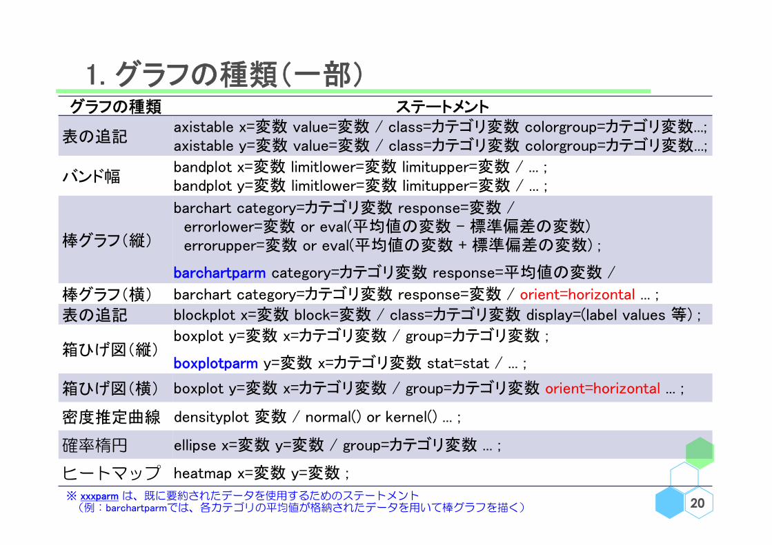
1. グラフの種類(一部)
20
グラフの種類 ステートメント
表の追記axistable x=変数 value=変数 / class=カテゴリ変数 colorgroup=カテゴリ変数...;axistable y=変数 value=変数 / class=カテゴリ変数 colorgroup=カテゴリ変数...;
バンド幅bandplot x=変数 limitlower=変数 limitupper=変数 / ... ;bandplot y=変数 limitlower=変数 limitupper=変数 / ... ;
棒グラフ(縦)
barchart category=カテゴリ変数 response=変数 / errorlower=変数 or eval(平均値の変数 - 標準偏差の変数) errorupper=変数 or eval(平均値の変数 + 標準偏差の変数) ;
barchartparm category=カテゴリ変数 response=平均値の変数 /
棒グラフ(横) barchart category=カテゴリ変数 response=変数 / orient=horizontal ... ;
表の追記 blockplot x=変数 block=変数 / class=カテゴリ変数 display=(label values 等) ;
箱ひげ図(縦)boxplot y=変数 x=カテゴリ変数 / group=カテゴリ変数 ;
boxplotparm y=変数 x=カテゴリ変数 stat=stat / ... ;
箱ひげ図(横) boxplot y=変数 x=カテゴリ変数 / group=カテゴリ変数 orient=horizontal ... ;
密度推定曲線 densityplot 変数 / normal() or kernel() ... ;
確率楕円 ellipse x=変数 y=変数 / group=カテゴリ変数 ... ;
ヒートマップ heatmap x=変数 y=変数 ;
※ xxxparm は、既に要約されたデータを使用するためのステートメント(例:barchartparmでは、各カテゴリの平均値が格納されたデータを用いて棒グラフを描く)

1. グラフの種類(一部)
21
グラフの種類 ステートメントヒストグラム histogram 変数 / ... ;
エラーバーhighlowplot x=変数 low=変数 high=変数 / group=カテゴリ変数 ... ;highlowplot y=変数 low=変数 high=変数 / group=カテゴリ変数 ... ;
平滑化曲線loessplot x=変数 y=変数 / alpha=0.05 ... ;pbsplineplot x=変数 y=変数 / alpha=0.05 ... ;
折れ線グラフlinechart category=カテゴリ変数 response=変数 / ... ;seriesplot x=変数 y=変数 / group=カテゴリ変数 ... ;
平滑化曲線等と併用したconfidence band
modelband "ユーザーが指定した信頼限界のラベル" / ... ;
→ 指定が一風変わっているので例 2 を参照のこと
モザイクプロット mosaicplotparm category=(カテゴリ変数1 カテゴリ変数2) count=頻度変数 ;
円グラフcategory=カテゴリ変数 ;category=カテゴリ変数 response=変数 / ... ;
回帰直線 regressionplot x=変数 y=変数 / alpha=0.05 ... ;
散布図scatterplot x=変数 y=変数 / group=カテゴリ変数 / group=カテゴリ変数 ... ;scatterplotmatrix 変数1 変数2 ... / group=カテゴリ変数 ... ;
Waterfall Plot waterfallchart category=カテゴリ変数 response=変数 / ... ;
参照線・直線referenceline x=値 y=値 / ... ;lineparm x=値 y=値 slope=傾きの値 / ... ;
※ プロットステートメントのオプションとしてエラーバーを出力した場合、線種の指定が難しい場合があるので、highlowplot を用いた方が良いかもしれない

1. グラフの種類(一部)
22
barchart boxplot histogram & densityplot
scatterplot & ellipse regressionplot, loessplot& pbsplineplot
seriesplot & referenceline
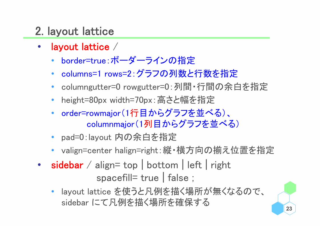
2. layout lattice• layout lattice /
• border=true:ボーダーラインの指定
• columns=1 rows=2:グラフの列数と行数を指定
• columngutter=0 rowgutter=0:列間・行間の余白を指定
• height=80px width=70px:高さと幅を指定
• order=rowmajor(1行目からグラフを並べる)、columnmajor(1列目からグラフを並べる)
• pad=0:layout 内の余白を指定
• valign=center halign=right:縦・横方向の揃え位置を指定
• sidebar / align= top | bottom | left | rightspacefill= true | false ;
• layout lattice を使うと凡例を描く場所が無くなるので、sidebar にて凡例を描く場所を確保する
23

3. ods listing & ods graphics で種々の設定
• グラフの綺麗さ等を指定(今回は 300dpi )
24
ods listing image_dpi=300 ;
ods graphics / reset height=450px width=450px ;
• height と width で横と縦の長さを指定(今回は px )
• sgrender プロシジャの前で以下を指定するとグラフに関する設定が出来る
Menu
• 事始
• 各論
• 軸
• 凡例
• 色、線、点
• 文字追記
• 雑多
25

例5:【軸】 連続値に対する指定
26
proc template ;define statgraph mytemplate ;begingraph ;layout overlay / xaxisopts=(offsetmin=0.05 offsetmax=0.05
label="SepalLength"linearopts=(tickvaluelist=(40 60 80)
viewmin=40 viewmax=80))yaxisopts=(offsetmin=0.05 offsetmax=0.05
label="SepalWidth"linearopts=(tickvaluesequence=(start=0 end=40
increment=10) viewmin=0)) ;scatterplot x=SepalLength y=SepalWidth /
group=Species ;endlayout ;
endgraph;end;
run;proc sgrender data=sashelp.iris template=mytemplate ;run ;

例5:【軸】 連続値に対する指定
27

軸:xaxisopts、yaxisopts に指定できるオプション
• display=(label line ticks tickvalues):軸に何を表示するか
• display=all | none:軸に上記 4 つを全て表示 | 何も表示しない
• griddisplay=on:グリッド線を表示
• label="XXX":軸のラベルを指定
• labelposition= left | right | top | bottom:ラベルの場所を指定
• labelattrs=(size= color= family=):ラベルの大きさや色を指定
• offsetmin=0.05 offsetmax=0.05:オフセットの幅を指定
• tickvalueattrs=(size= color= family=):目盛の大きさや色を指定
• tickvaluefitpolicy= thin | rotate | split:ラベルが長すぎて入らない場合の処理方法
• type=log logopts=(base=10 tickintervalstyle=logexpand | logexponent | linear):対数グラフを指定
28
軸:xaxisopts、yaxisopts に指定できるオプション
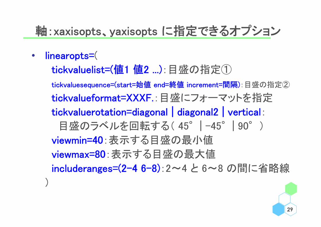
• linearopts=(
tickvaluelist=(値1 値2 ...):目盛の指定①
tickvaluesequence=(start=始値 end=終値 increment=間隔):目盛の指定②
tickvalueformat=XXXF.:目盛にフォーマットを指定
tickvaluerotation=diagonal | diagonal2 | vertical:
目盛のラベルを回転する( 45°| -45°| 90°)
viewmin=40:表示する目盛の最小値
viewmax=80:表示する目盛の最大値
includeranges=(2-4 6-8):2~4 と 6~8 の間に省略線
)
29
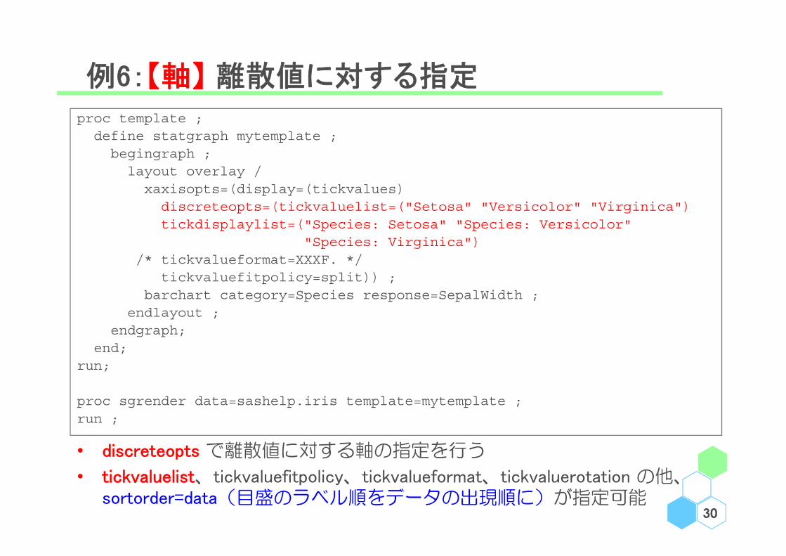
例6:【軸】 離散値に対する指定
30
proc template ;define statgraph mytemplate ;begingraph ;layout overlay / xaxisopts=(display=(tickvalues) discreteopts=(tickvaluelist=("Setosa" "Versicolor" "Virginica")tickdisplaylist=("Species: Setosa" "Species: Versicolor"
"Species: Virginica")/* tickvalueformat=XXXF. */
tickvaluefitpolicy=split)) ;barchart category=Species response=SepalWidth ;
endlayout ;endgraph;
end;run;
proc sgrender data=sashelp.iris template=mytemplate ;run ;
• discreteopts で離散値に対する軸の指定を行う
• tickvaluelist、tickvaluefitpolicy、tickvalueformat、tickvaluerotation の他、sortorder=data(目盛のラベル順をデータの出現順に)が指定可能
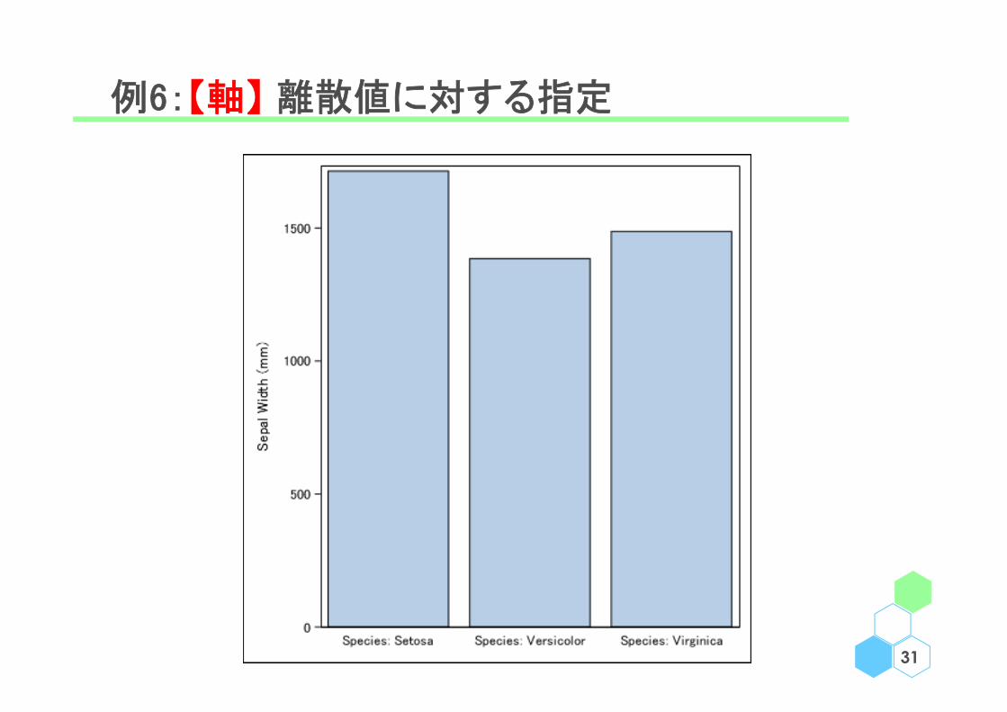
例6:【軸】 離散値に対する指定
31
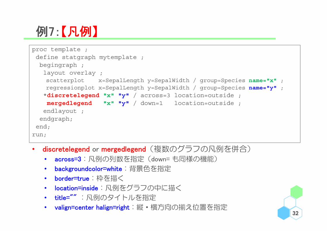
例7:【凡例】
32
proc template ;define statgraph mytemplate ;begingraph ;layout overlay ;scatterplot x=SepalLength y=SepalWidth / group=Species name="x" ;regressionplot x=SepalLength y=SepalWidth / group=Species name="y" ;
*discretelegend "x" "y" / across=3 location=outside ;mergedlegend "x" "y" / down=1 location=outside ;endlayout ;
endgraph;end;run;
• discretelegend or mergedlegend(複数のグラフの凡例を併合)
• across=3:凡例の列数を指定(down= も同様の機能)
• backgroundcolor=white:背景色を指定
• border=true:枠を描く
• location=inside:凡例をグラフの中に描く
• title="" :凡例のタイトルを指定
• valign=center halign=right:縦・横方向の揃え位置を指定
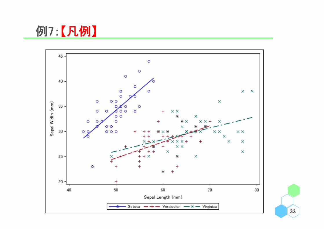
例7:【凡例】
33

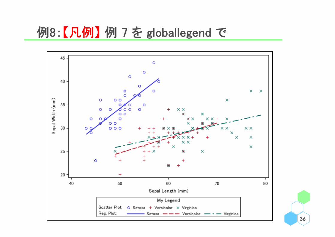
凡例:discretelegend/mergedlegend/globallegend
• 例 7 で示した通り、 discretelegend や mergedlegend で単一
でも複数のグラフでも綺麗に凡例を描くことが出来る
• layout globallegend により、複数のグラフの凡例について
詳細に指定を行うことが出来る
• border=true:枠を描く
• borderattrs=・・・:枠の書式を設定
• title="" :凡例のタイトルを指定
• legendtitleposition=left | top:凡例のタイトルの位置を指定
• titleattrs=・・・:枠の書式を設定する
• halign=center | left | right: 横方向の揃え位置を指定
• type=row | column:複数の凡例の並べ順(縦方向 | 横方向)を指定
34

例8:【凡例】 例 7 を globallegend で
35
proc template ;define statgraph mytemplate ;begingraph ;layout overlay ;scatterplot x=SepalLength y=SepalWidth / group=Species name="x" ;regressionplot x=SepalLength y=SepalWidth / group=Species name="y" ;endlayout ;layout globallegend / type=column title=“My Legend” halign=center ;discretelegend “x” / title=“Scatter Plot:” ;discretelegend “y” / title=“Reg. Plot:” ;endlayout;
endgraph;end;
run;
ods graphics / height=450px width=600px ;proc sgrender data=sashelp.iris template=mytemplate ;run ;
例8:【凡例】 例 7 を globallegend で
36
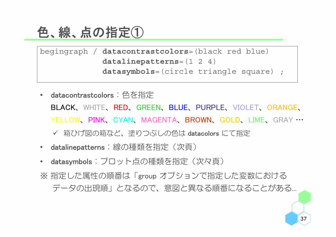
色、線、点の指定①
37
begingraph / datacontrastcolors=(black red blue) datalinepatterns=(1 2 4)datasymbols=(circle triangle square) ;
• datacontrastcolors:色を指定
BLACK、WHITE、RED、GREEN、BLUE、PURPLE、VIOLET、ORANGE、
YELLOW、PINK、CYAN、MAGENTA、BROWN、GOLD、LIME、GRAY …
箱ひげ図の箱など、塗りつぶしの色は datacolors にて指定
• datalinepatterns:線の種類を指定(次頁)
• datasymbols:プロット点の種類を指定(次々頁)
※ 指定した属性の順番は「group オプションで指定した変数における
データの出現順」となるので、意図と異なる順番になることがある...

線の指定
38
番号 キーワード 線
1 Solid
2 ShortDash
4 MediumDash
5 LongDash
8 MediumDashShortDash
14 DashDashDot
15 DashDotDot
20 Dash
26 LongDashShortDash
34 Dot
35 ThinDot
41 ShortDashDot
42 MediumDashDotDot
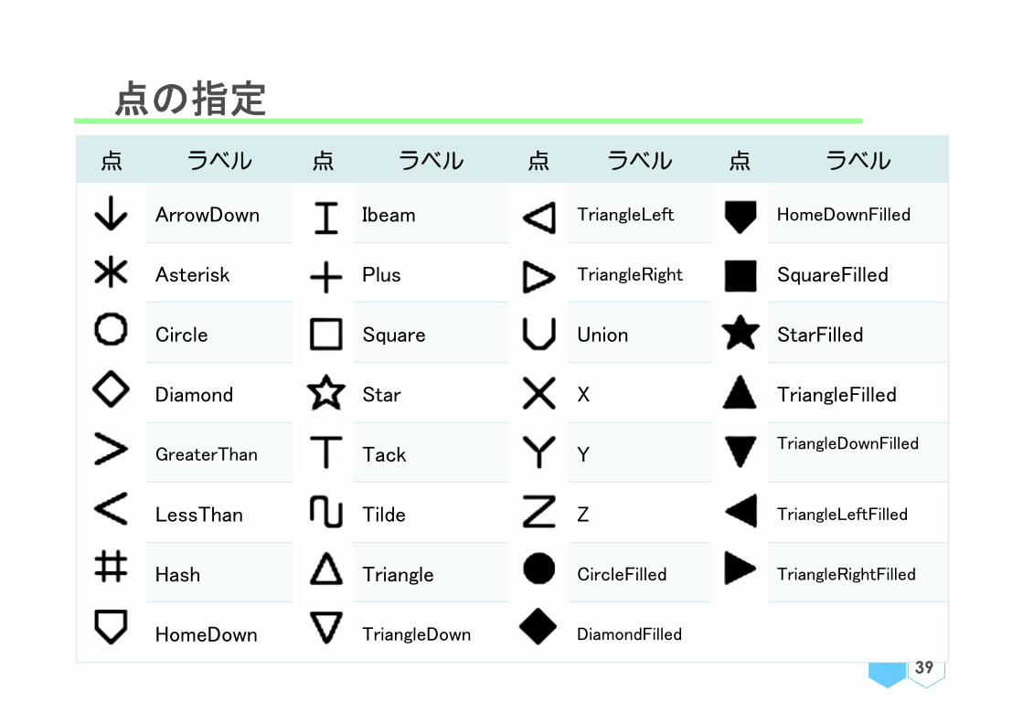
点の指定
点 ラベル 点 ラベル 点 ラベル 点 ラベル
ArrowDown Ibeam TriangleLeft HomeDownFilled
Asterisk Plus TriangleRight SquareFilled
Circle Square Union StarFilled
Diamond Star X TriangleFilled
GreaterThan Tack YTriangleDownFilled
LessThan Tilde Z TriangleLeftFilled
Hash Triangle CircleFilled TriangleRightFilled
HomeDown TriangleDown DiamondFilled
39

例9:【色、線、点の指定① 】 例 4 より
40
proc template ;define statgraph mytemplate ;
begingraph / datacontrastcolors=(black red blue) datalinepatterns=(1 2 4) ;
................................................endgraph ;
end ;run ;
proc sgrender data=KM_DATA template=mytemplate ;format Time DAYF. StratumNum STRF. ;
run ;
data KM_DATA2 ; set KM_DATA(where=(StratumNum ne 1)) KM_DATA(where=(StratumNum=1)) ; * 群の順番変更 ;
proc sgrender data=KM_DATA2 template=mytemplate ;format Time DAYF. StratumNum STRF. ;
run ;
• begingraph で「指定した属性の順番は group オプション等で指定した
変数におけるデータの出現順」となる例
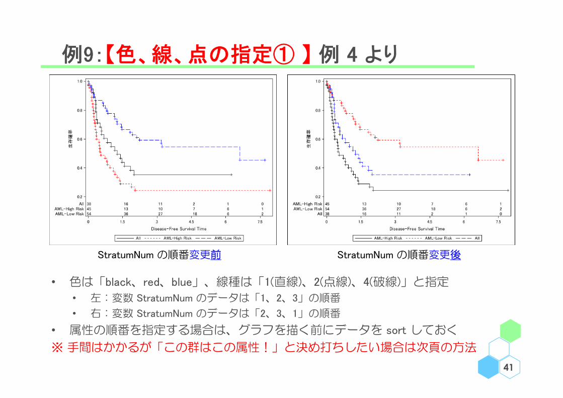
例9:【色、線、点の指定① 】 例 4 より
41
StratumNum の順番変更前 StratumNum の順番変更後
• 色は「black、red、blue」、線種は「1(直線)、2(点線)、4(破線)」と指定
• 左:変数 StratumNum のデータは「1、2、3」の順番
• 右:変数 StratumNum のデータは「2、3、1」の順番
• 属性の順番を指定する場合は、グラフを描く前にデータを sort しておく
※ 手間はかかるが「この群はこの属性!」と決め打ちしたい場合は次頁の方法
色、線、点の指定②
42
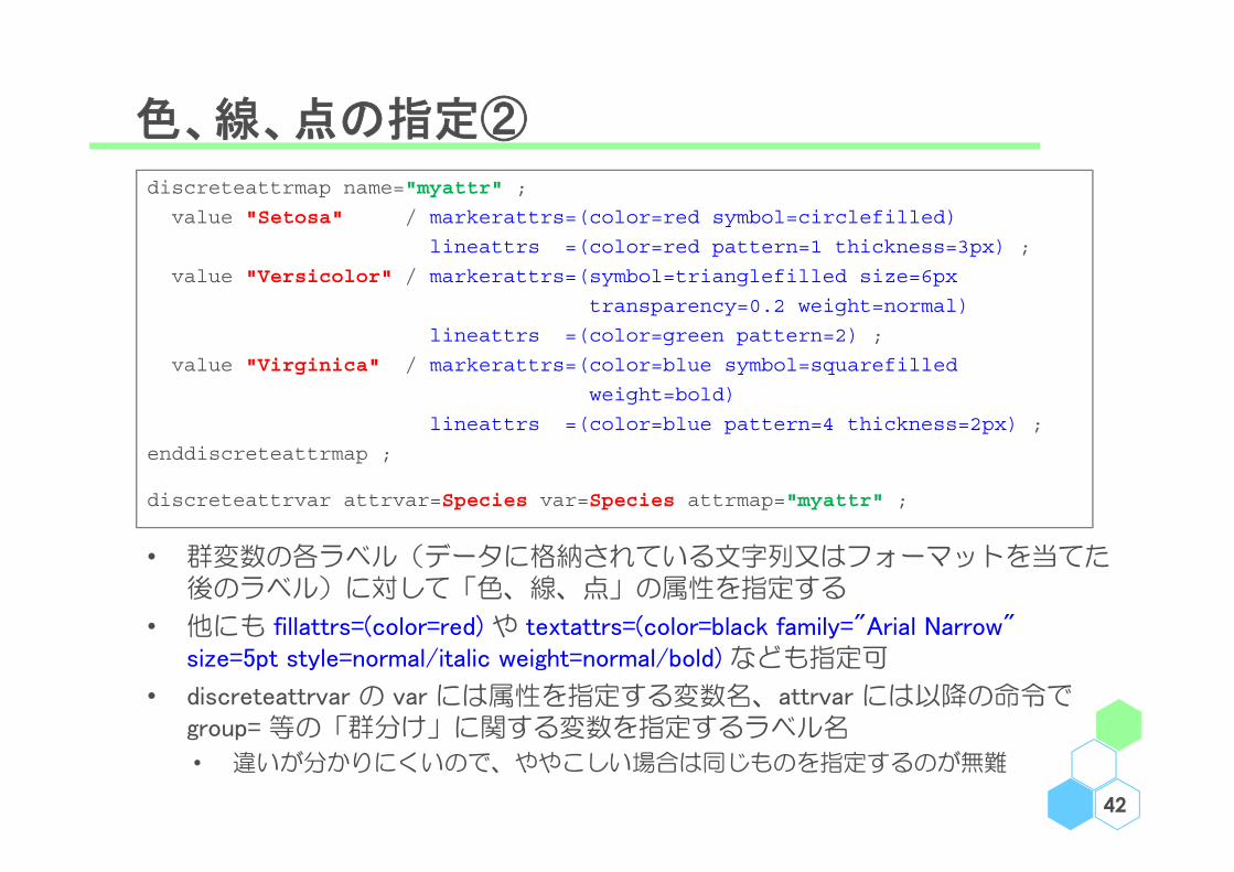
discreteattrmap name="myattr" ;
value "Setosa" / markerattrs=(color=red symbol=circlefilled)
lineattrs =(color=red pattern=1 thickness=3px) ;
value "Versicolor" / markerattrs=(symbol=trianglefilled size=6px
transparency=0.2 weight=normal)
lineattrs =(color=green pattern=2) ;
value "Virginica" / markerattrs=(color=blue symbol=squarefilled
weight=bold)
lineattrs =(color=blue pattern=4 thickness=2px) ;
enddiscreteattrmap ;
discreteattrvar attrvar=Species var=Species attrmap="myattr" ;
• 群変数の各ラベル(データに格納されている文字列又はフォーマットを当てた後のラベル)に対して「色、線、点」の属性を指定する
• 他にも fillattrs=(color=red) や textattrs=(color=black family="Arial Narrow" size=5pt style=normal/italic weight=normal/bold) なども指定可
• discreteattrvar の var には属性を指定する変数名、attrvar には以降の命令でgroup= 等の「群分け」に関する変数を指定するラベル名
• 違いが分かりにくいので、ややこしい場合は同じものを指定するのが無難

例10:【色、線、点の指定② 】
43
proc template ;define statgraph mytemplate ;begingraph ;discreteattrmap name="myattr" ;value "Setosa" / markerattrs=(color=red symbol=circlefilled)lineattrs=(color=red pattern=1 thickness=3px) ;
value "Versicolor" / markerattrs=(symbol=trianglefilled size=6px transparency=0.2 weight=normal) lineattrs=(color=green pattern=2);
value "Virginica" / markerattrs=(color=blue symbol=squarefilledweight=bold) lineattrs=(color=blue pattern=4 thickness=2px) ;
enddiscreteattrmap ;discreteattrvar attrvar=Species var=Species attrmap="myattr" ;layout overlay ;regressionplot x=SepalLength y=SepalWidth / group=Species name="x" ;scatterplot x=SepalLength y=SepalWidth / group=Species name="y" ;mergedlegend "x" "y" / down=1 location=outside valign=top title="" ;
endlayout ;endgraph ;
end ;run ;
proc sgrender data=sashelp.iris template=mytemplate ; run ;
• 他にも fillattrs=(color=red) や textattrs=(color=black family="Arial Narrow" size=5pt
style=normal/italic weight=normal/bold) なども指定可

例10:【色、線、点の指定② 】
44
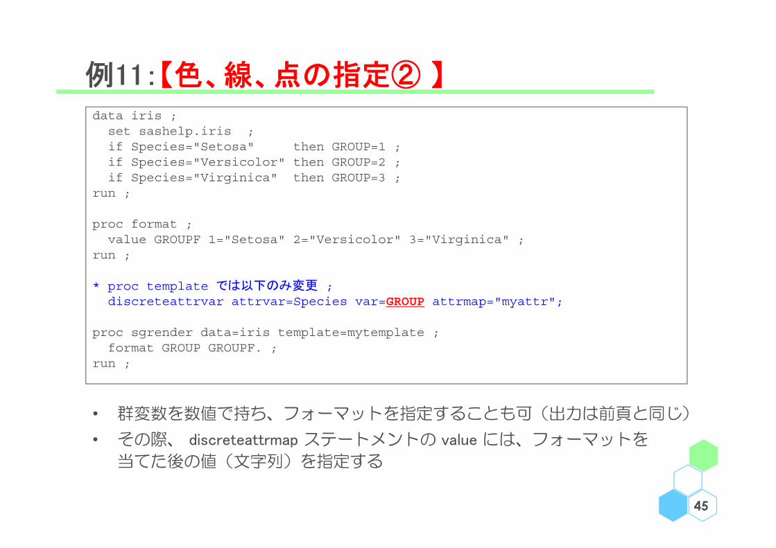
例11:【色、線、点の指定② 】
45
• 群変数を数値で持ち、フォーマットを指定することも可(出力は前頁と同じ)
• その際、 discreteattrmap ステートメントの value には、フォーマットを
当てた後の値(文字列)を指定する
data iris ;set sashelp.iris ;if Species="Setosa" then GROUP=1 ;if Species="Versicolor" then GROUP=2 ;if Species="Virginica" then GROUP=3 ;
run ;
proc format ;value GROUPF 1="Setosa" 2="Versicolor" 3="Virginica" ;
run ;
* proc template では以下のみ変更 ;discreteattrvar attrvar=Species var=GROUP attrmap="myattr";
proc sgrender data=iris template=mytemplate ;format GROUP GROUPF. ;
run ;

例12:【色、線、点の指定② 】
46
ods output summary=TMP(keep=Species SepalLength_Mean SepalLength_StdDev) ;proc means data=sashelp.iris ;class Species ; var SepalLength ;
run ;
data OUT ;set TMP TMP(in=A) ;if (A) then TIME="1" ;else do ; TIME="2" ; SepalLength_Mean+5 ; end ;
proc sort data=OUT ; by descending Species descending TIME ; run ;
proc template ;define statgraph mytemplate ;begingraph ;discreteattrmap name="myattr" ;value "Setosa" / markerattrs=(color=red symbol=circlefilled)
lineattrs=(color=red pattern=1 thickness=3px) ;value "Versicolor" / markerattrs=(symbol=trianglefilled size=6px transparency=0.2 weight=normal)
lineattrs=(color=green pattern=2) ;value "Virginica" / markerattrs=(color=blue symbol=squarefilled weight=bold)
lineattrs=(color=blue pattern=4 thickness=2px) ;enddiscreteattrmap ;discreteattrvar attrvar=Species var=Species attrmap="myattr";
layout overlay ;scatterplot x=TIME y=SepalLength_Mean / group=Species groupdisplay=cluster clusterwidth=0.1 name="x" ;highlowplot x=TIME low=eval(SepalLength_Mean-SepalLength_StdDev) high=eval(SepalLength_Mean+
SepalLength_StdDev) / group=Species groupdisplay=cluster clusterwidth=0.1 ;seriesplot x=TIME y=SepalLength_Mean / group=Species groupdisplay=cluster clusterwidth=0.1 name="y";mergedlegend "x" "y" / down=1 location=outside valign=top title="" ;
endlayout ;endgraph ;
end ;run ;
proc sgrender data=OUT template=mytemplate ;run ;

例12:【色、線、点の指定② 】
47
• リストの順番が「group オプションで指定した変数におけるデータの出現順」 となることを利用しカテゴリ変数を文字で保持&前もっていい感じにソートすることで表示順を好きなように変更することが可能(この場合は変数 TIME と Species)
• template プロシジャ内では、いくつかの関数(例えば eval() )が使用可能
• 「group=変数 groupdisplay=cluster clusterwidth=0.X」でプロットずらしが可能
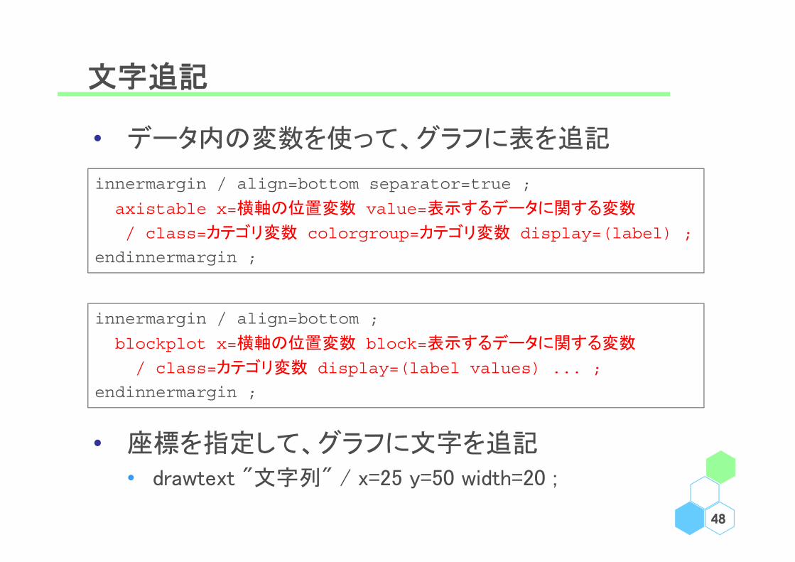
文字追記
• データ内の変数を使って、グラフに表を追記
• 座標を指定して、グラフに文字を追記
• drawtext "文字列" / x=25 y=50 width=20 ;
48
innermargin / align=bottom separator=true ;
axistable x=横軸の位置変数 value=表示するデータに関する変数
/ class=カテゴリ変数 colorgroup=カテゴリ変数 display=(label) ;
endinnermargin ;
innermargin / align=bottom ;
blockplot x=横軸の位置変数 block=表示するデータに関する変数
/ class=カテゴリ変数 display=(label values) ... ;
endinnermargin ;

例1':【文字追記】 単純なグラフにタイトルと脚注
49
proc template ;define statgraph mytemplate ;begingraph ;entrytitle "タイトル" / pad=(bottom=4px) ;layout overlay ;histogram SepalLength ;
endlayout ;entryfootnote halign=left textattrs=(size=7) "脚注" ;endgraph ;
end ;run ;
proc sgrender data=sashelp.iris template=mytemplate ;run ;
• entrytitle と entryfootnote でタイトルと脚注を追記
• entry で文字列を追記する(後述:例 15 にて)

例1':【文字追記】 単純なグラフにタイトルと脚注
50

例13:【文字追記】 要約統計量や文字の追記
51
proc template ;
define statgraph mytemplate ;
begingraph ;
layout overlay ;
barchart category=Species response=SepalWidth ;
innermargin / align=bottom ;
axistable x=Species value=SepalWidth / stat=sum label="Total" ;
axistable x=Species value=SepalWidth / stat=mean label="Mean" ;
endinnermargin ;
drawtext "Setosa" / x=25 y=50 width=20 ;
endlayout ;
endgraph ;
end ;
run ;
proc sgrender data=sashelp.iris template=mytemplate ;
run ;
• innermargin / axistable や drawtext で要約統計量や文字の追記が可

例13:【文字追記】 要約統計量や文字の追記
52

例4':【文字追記】 Kaplan-Meier Plot
53
ods output Survivalplot=KM_DATA ;proc lifetest data=sashelp.bmt plots=survival(atrisk=0 to 2500 by 500);time T * Status(0) ; strata Group ;
proc format ;value STRF 1="All" 2="AML-High Risk" 3="AML-Low Risk" ; value DAYF 0="0" 500="1.5" 1000="3" 1500="4.5" 2000="6" 2500="7.5" ;
run ;
proc template ;define statgraph mytemplate ;begingraph / datacontrastcolors=(black red blue) datalinepatterns=(1 2 4);layout overlay ;stepplot x=Time y=Survival / group=StratumNum name="x" ;scatterplot x=Time y=Survival / group=StratumNum
markerattrs=(symbol=plus) ;innermargin / align=bottom ;blockplot x=tAtRisk block=AtRisk / class=StratumNum
display=(label values) ;endinnermargin ;discretelegend "x" ;
endlayout ;endgraph ;
end ;run ;
proc sgrender data=KM_DATA template=mytemplate ;format Time DAYF. StratumNum STRF. ;
run ;

例4':【文字追記】 Kaplan-Meier Plot
54

例4'':【文字追記】 Kaplan-Meier Plot
55
ods output Survivalplot=KM_DATA ;proc lifetest data=sashelp.bmt plots=survival(atrisk=0 to 2500 by 500);time T * Status(0) ; strata Group ;
proc format ;value STRF 1="All" 2="AML-High Risk" 3="AML-Low Risk" ; value DAYF 0="0" 500="1.5" 1000="3" 1500="4.5" 2000="6" 2500="7.5" ;
run ;
proc template ;define statgraph mytemplate ;begingraph / datacontrastcolors=(black red blue) datalinepatterns=(1 2 4);layout overlay ;stepplot x=Time y=Survival / group=StratumNum name="x" ;scatterplot x=Time y=Survival / group=StratumNum
markerattrs=(symbol=plus) ;innermargin / align=bottom separator=true ;axistable x=tAtRisk value=AtRisk / class=StratumNum display=(label)
colorgroup=StratumNum valueattrs=(size=8) labelattrs=(size=8);endinnermargin ;discretelegend "x" ;
endlayout ;endgraph ;
end ;run ;
proc sgrender data=KM_DATA template=mytemplate ;format Time DAYF. StratumNum STRF. ;
run ;

例4'':【文字追記】 Kaplan-Meier Plot
56

例14:【文字追記】 Forest Plot 用のデータ OUT
57
ods output summary=TMP ;proc means data=sashelp.iris mean lclm uclm fw=4;
class Species ; var SepalWidth ;run ;
data OUT ;set TMP TMP TMP ;ID=_N_ ;Group="Group "||strip(_N_) ;if (Species="Setosa") then do ; R=Group ; W=0 ; end ; else W=1 ;label SepalWidth_LCLM="Lower" SepalWidth_UCLM="Upper" ;rename SepalWidth_Mean=Mean SepalWidth_LCLM=Low SepalWidth_UCLM=High ;
run ;
ID Group Species NObs Mean Low High R W1 Group 1 Setosa 50 34.3 33.2 35.4 Group 1 02 Group 2 Versicolor 50 27.7 26.8 28.6 13 Group 3 Virginica 50 29.7 28.8 30.7 14 Group 4 Setosa 50 34.3 33.2 35.4 Group 4 05 Group 5 Versicolor 50 27.7 26.8 28.6 16 Group 6 Virginica 50 29.7 28.8 30.7 17 Group 7 Setosa 50 34.3 33.2 35.4 Group 7 08 Group 8 Versicolor 50 27.7 26.8 28.6 19 Group 9 Virginica 50 29.7 28.8 30.7 1
例14:【文字追記】 Forest Plot ①
58
proc template;define statgraph mytemplate ;begingraph ; * layout lattice のオプションで列数と列の幅を指定 ;layout lattice / columns=6 columnweights=(0.15 0.1 0.45 0.1 0.1 0.1) ;
*** 1列目:カテゴリ ;layout overlay / walldisplay=none
yaxisopts=(reverse=true display=none) ;referenceline y=R / lineattrs=(thickness=20 color=cyan) ;axistable y=Group value=Group / indentweight=W ;
endlayout ;
*** 2列目:例数 ;layout overlay / walldisplay=none
yaxisopts=(reverse=true display=none) ; referenceline y=R / lineattrs=(thickness=20 color=cyan) ;axistable y=Group value=NObs ;
endlayout;
*** 3列目:Forest Plot ;layout overlay / walldisplay=none yaxisopts=(reverse=true display=none)xaxisopts=(label='Small Large' linearopts=(tickvaluepriority=true tickvaluelist=(25 30 35))) ;
referenceline y=R / lineattrs=(thickness=20 color=cyan) ;scatterplot y=Group x=Mean / markerattrs=(symbol=circlefilled) ;highlowplot y=Group low=Low high=High ;referenceline x=30 ;
endlayout;

例14:【文字追記】 Forest Plot ①
59
*** 4列目:平均値 ;layout overlay / walldisplay=none yaxisopts=(reverse=true display=none) ;referenceline y=R / lineattrs=(thickness=20 color=cyan) ;axistable y=Group value=Mean ;
endlayout;
*** 5列目:95% CI(下側) ;layout overlay / walldisplay=none yaxisopts=(reverse=true display=none) ;referenceline y=R / lineattrs=(thickness=20 color=cyan) ;axistable y=Group value=Low ;
endlayout;
*** 6列目:95% CI(上側) ;layout overlay / walldisplay=none yaxisopts=(reverse=true display=none) ;referenceline y=R / lineattrs=(thickness=20 color=cyan) ;axistable y=Group value=High ;
endlayout;
endlayout ;endgraph ;end ;
run ;
proc sgrender data=OUT template=mytemplate ;run ;
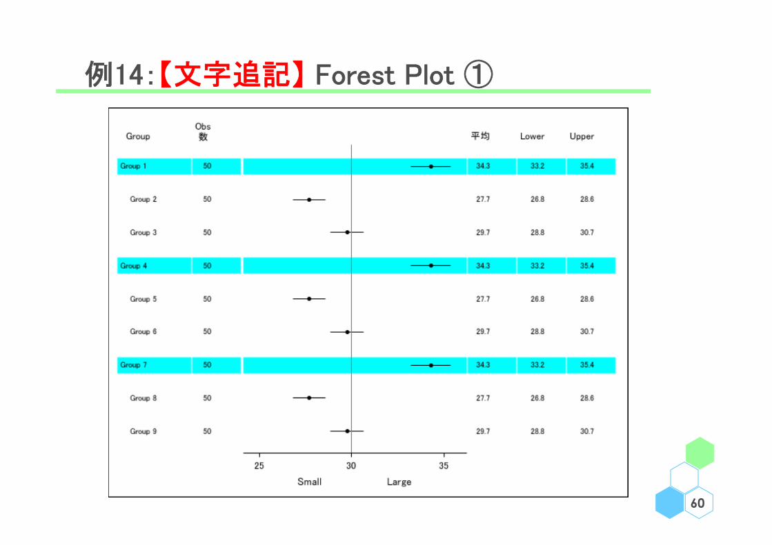
例14:【文字追記】 Forest Plot ①
60

例15:【文字追記】 Forest Plot ② ヘッダ追加等
61
proc template;define statgraph mytemplate ;dynamic _BW _COL _DT ; * 例16で少し触れる ;begingraph ; * layout lattice のオプションで列数と列の幅を指定 ;layout lattice / columns=6 columnweights=(0.15 0.1 0.45 0.1 0.1 0.1) ;
*** ヘッダ ;sidebar / align=top ;layout lattice / rows=1 columns=5
columnweights=(0.15 0.1 0.45 0.1 0.2) ;entry textattrs=(size=8) halign=left "Group" ;entry textattrs=(size=8) halign=left "# of Sub." ;entry textattrs=(size=8) halign=center "Mean Plot" ;entry textattrs=(size=8) halign=left "Mean" ;entry textattrs=(size=8) halign=left " 95% CI" ;
endlayout ;endsidebar ;
*** 1列目:カテゴリ ;layout overlay / walldisplay=none yaxisopts=(reverse=true display=none) ;
referenceline y=R / lineattrs=(thickness=_BW color=_COL)datatransparency=_DT ;
(中略)proc sgrender data=OUT template=mytemplate ;dynamic _BW=20 _COL="cyan" _DT=0.8 ;
run ;

例15:【文字追記】 Forest Plot ② ヘッダ追加等
62

Menu
• 事始
• 各論
• 軸
• 凡例
• 色、線、点
• 文字追記
• 雑多
63

例16:マクロ変数の定義等
64
proc template ;define statgraph mytemplate ;dynamic _VAR ;nmvar _WIDTH ;mvar _GROUP ;begingraph ;layout overlay ;histogram _VAR / binwidth=_WIDTH group=_GROUP ;
endlayout ;endgraph ;
end ;run ;
%let _WIDTH=5 ;%let _GROUP=Species ;proc sgrender data=sashelp.iris template=mytemplate ;
dynamic _VAR="SepalLength" ;run ;
• 例 15 で使用した dynamic ステートメントが GTL でも有効
• nmvar、nvar ステートメントで、それぞれ数値変数マクロと文字変数マクロを定義
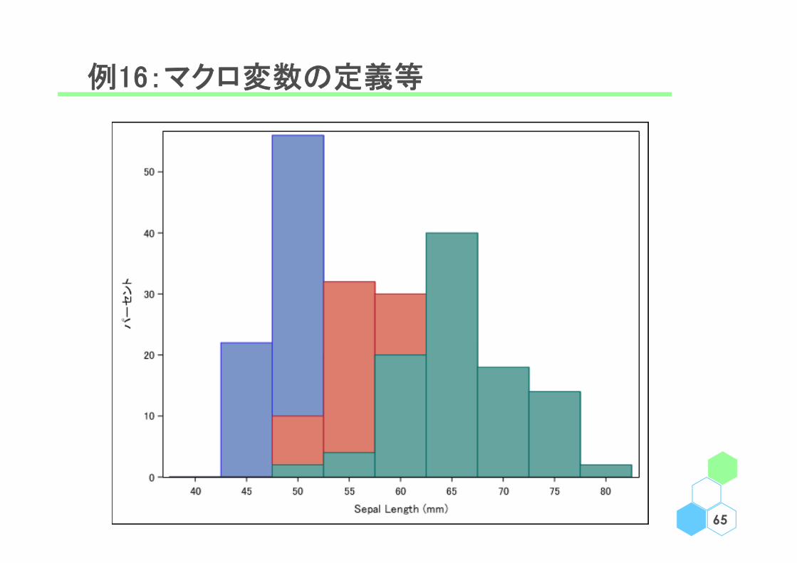
例16:マクロ変数の定義等
65
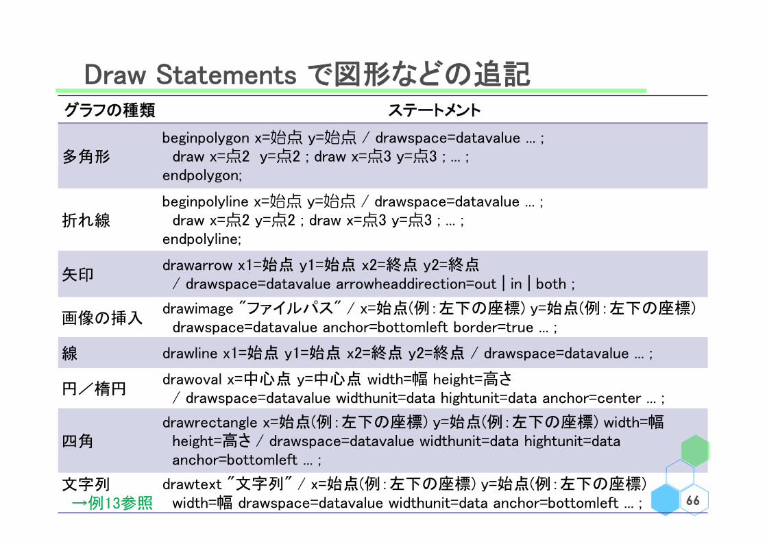
Draw Statements で図形などの追記
66
グラフの種類 ステートメント
多角形beginpolygon x=始点 y=始点 / drawspace=datavalue ... ;
draw x=点2 y=点2 ; draw x=点3 y=点3 ; ... ;endpolygon;
折れ線beginpolyline x=始点 y=始点 / drawspace=datavalue ... ;draw x=点2 y=点2 ; draw x=点3 y=点3 ; ... ;
endpolyline;
矢印drawarrow x1=始点 y1=始点 x2=終点 y2=終点/ drawspace=datavalue arrowheaddirection=out | in | both ;
画像の挿入drawimage "ファイルパス" / x=始点(例:左下の座標) y=始点(例:左下の座標)drawspace=datavalue anchor=bottomleft border=true ... ;
線 drawline x1=始点 y1=始点 x2=終点 y2=終点 / drawspace=datavalue ... ;
円/楕円drawoval x=中心点 y=中心点 width=幅 height=高さ/ drawspace=datavalue widthunit=data hightunit=data anchor=center ... ;
四角drawrectangle x=始点(例:左下の座標) y=始点(例:左下の座標) width=幅height=高さ / drawspace=datavalue widthunit=data hightunit=dataanchor=bottomleft ... ;
文字列→例13参照
drawtext "文字列" / x=始点(例:左下の座標) y=始点(例:左下の座標)width=幅 drawspace=datavalue widthunit=data anchor=bottomleft ... ;
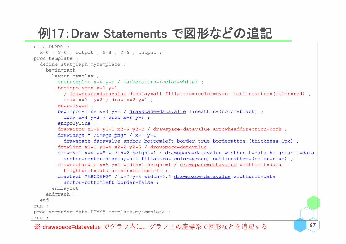
例17:Draw Statements で図形などの追記
67
data DUMMY ;X=0 ; Y=0 ; output ; X=8 ; Y=6 ; output ;
proc template ;define statgraph mytemplate ;
begingraph ;layout overlay ;
scatterplot x=X y=Y / markerattrs=(color=white) ;beginpolygon x=1 y=1
/ drawspace=datavalue display=all fillattrs=(color=cyan) outlineattrs=(color=red) ;draw x=1 y=2 ; draw x=2 y=1 ;
endpolygon ;beginpolyline x=3 y=1 / drawspace=datavalue lineattrs=(color=black) ;
draw x=4 y=2 ; draw x=3 y=3 ; endpolyline ;drawarrow x1=5 y1=1 x2=6 y2=2 / drawspace=datavalue arrowheaddirection=both ;drawimage "./image.png" / x=7 y=1
drawspace=datavalue anchor=bottomleft border=true borderattrs=(thickness=1px) ;drawline x1=1 y1=4 x2=2 y2=5 / drawspace=datavalue ;drawoval x=4 y=5 width=2 height=1 / drawspace=datavalue widthunit=data heightunit=data
anchor=center display=all fillattrs=(color=green) outlineattrs=(color=blue) ;drawrectangle x=6 y=4 width=1 height=1 / drawspace=datavalue widthunit=data
heightunit=data anchor=bottomleft ;drawtext "ABCDEFG" / x=7 y=3 width=0.6 drawspace=datavalue widthunit=data
anchor=bottomleft border=false ;endlayout ;
endgraph ;end ;
run ;proc sgrender data=DUMMY template=mytemplate ;run ;
※ drawspace=datavalue でグラフ内に、グラフ上の座標系で図形などを追記する
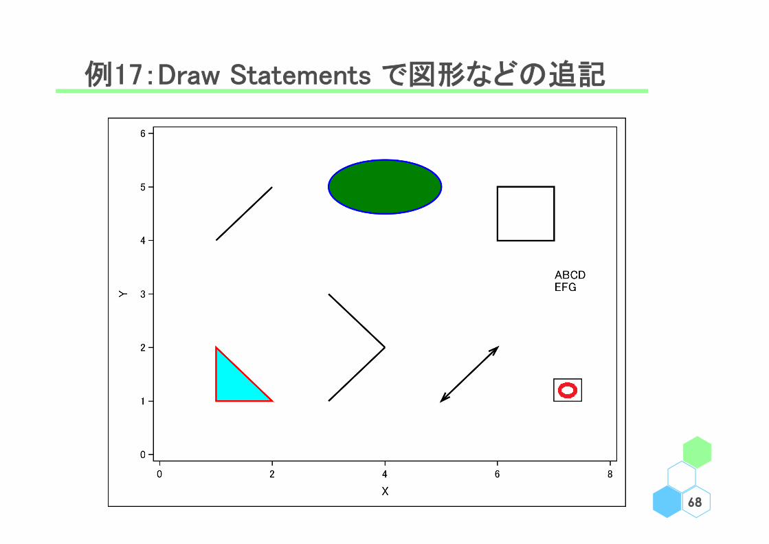
例17:Draw Statements で図形などの追記
68
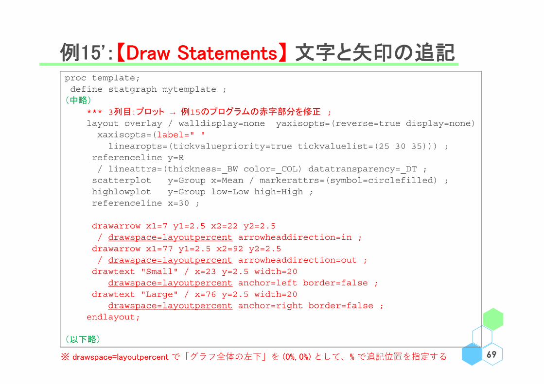
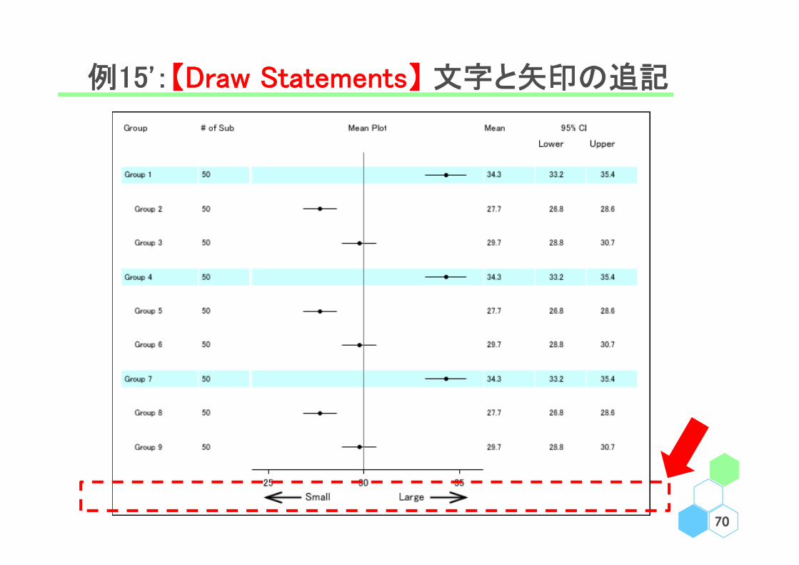
例15':【Draw Statements】 文字と矢印の追記
69
proc template;define statgraph mytemplate ;
(中略)
*** 3列目:プロット → 例15のプログラムの赤字部分を修正 ;layout overlay / walldisplay=none yaxisopts=(reverse=true display=none)xaxisopts=(label=" " linearopts=(tickvaluepriority=true tickvaluelist=(25 30 35))) ;
referenceline y=R/ lineattrs=(thickness=_BW color=_COL) datatransparency=_DT ;scatterplot y=Group x=Mean / markerattrs=(symbol=circlefilled) ;highlowplot y=Group low=Low high=High ;referenceline x=30 ;
drawarrow x1=7 y1=2.5 x2=22 y2=2.5/ drawspace=layoutpercent arrowheaddirection=in ;drawarrow x1=77 y1=2.5 x2=92 y2=2.5 / drawspace=layoutpercent arrowheaddirection=out ;drawtext "Small" / x=23 y=2.5 width=20
drawspace=layoutpercent anchor=left border=false ;drawtext "Large" / x=76 y=2.5 width=20
drawspace=layoutpercent anchor=right border=false ;endlayout;
(以下略)
※ drawspace=layoutpercent で「グラフ全体の左下」を (0%, 0%) として、% で追記位置を指定する
例15':【Draw Statements】 文字と矢印の追記
70

今回扱わなかった内容
• その他の layout statements:
layout datapanel、layout datalattice、layout gridded、
layout overlay3D、layout prototype、layout region
• Custom marker definition statements
• Annotate statement
• Range attribute map statements
(Discrete attribute map statementsは説明済み)
71

例18:今回扱わなかった datapanel & datalattice ①
72
proc template ;define statgraph mytemplate ;begingraph ;entrytitle "Title" ;layout datapanel
classvars=(Species) ;layout prototype ;scatterplot x=SepalLength
y=SepalWidth ;endlayout ;endlayout;
endgraph;end;run;
proc sgrender data=sashelp.iristemplate=mytemplate ;
run ;
proc template ;define statgraph mytemplate ;begingraph ;entrytitle "Title" ;layout datalattice
columnvar=Species ;layout prototype ;scatterplot x=SepalLength
y=SepalWidth ;endlayout ;endlayout;
endgraph;end;run;
proc sgrender data=sashelp.iristemplate=mytemplate ;
run ;

例18:今回扱わなかった datapanel & datalattice ①
73

例19:今回扱わなかった datapanel & datalattice ②
74
ods output summary=TMP(keep=Species SepalLength_Mean) ;proc means data=sashelp.iris ;
class Species ; var SepalLength ;run ;data OUT ;
set TMP(in=A) TMP(in=B) TMP(in=C) ;if (A) then TIME="1" ; if (B) then TIME="2" ; if (C) then TIME="3" ;
run ;
proc template ;define statgraph mytemplate ;
begingraph ;entrytitle "Title" ;layout datalattice columnvar=TIME /
headerlabeldisplay=value columnheaders=bottom border=false columndatarange=union columnaxisopts=(display=(line tickvalues) /* tickvalueattrs=(size=6) */ ) rowaxisopts=(offsetmin=0 linearopts=(tickvaluepriority=true tickvaluelist=(0 40 80)
viewmin=0 viewmax=80) label="Sepal Length" griddisplay=on) ;layout prototype / walldisplay=(fill) ;
barchart x=Species y=SepalLength_Mean / group=TIME barlabel=true ;endlayout; drawtext "p = 0.0300" / x=33 y=90 width=20 ;drawtext "p = 0.0020" / x=63 y=90 width=20 ;drawtext "p < 0.0001" / x=93 y=90 width=20 ;
endlayout; endgraph;
end;run;
proc sgrender data=OUT template=mytemplate ;run ;

例19:今回扱わなかった datapanel & datalattice ②
75

Menu
• 事始
• 各論
• 軸
• 凡例
• 色、線、点
• 文字追記
• 雑多
76

参考文献
• SAS "Graph Template Language Reference", Fifth Edition.
http://support.sas.com/documentation/cdl//en/grstatgraph/69718/HTML/default/viewer.htm
• SAS "Graph Template Language Tip Sheet".
http://support.sas.com/rnd/app/ODSGraphics/TipSheet_GTL.pdf
• SAS/STAT User's Guide "Customizing the Kaplan-Meier Survival Plot".
https://support.sas.com/documentation/onlinedoc/stat/141/kaplan.pdf
https://support.sas.com/documentation/onlinedoc/stat/151/kaplan.pdf
• Sanjay Matange (2013) "Getting Start with the Graph Template
Language in SAS", SAS Institute.
• 舟尾 "もしも SAS の sgplot と R の ggplot2 を比較したら",
http://nfunao.web.fc2.com/files/sgplot_vs_ggplot2.pdf 77

END OF CONTENTS