juggle' presentation
DESCRIPTION
ÂTRANSCRIPT
Juggle Brand Development
Making Sense

JuggleUsing the ‘J’ element to create a logo for ‘juggle’. The logo also contains a mirrored ‘J’. This helps to communicate the dualistc nature of the brand, where two elements have come together to create a whole.


Development

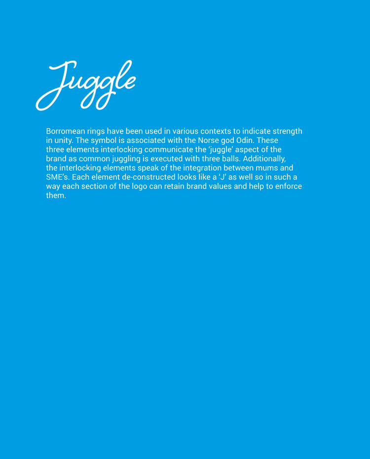
JuggleBorromean rings have been used in various contexts to indicate strength in unity. The symbol is associated with the Norse god Odin. These three elements interlocking communicate the ‘juggle’ aspect of the brand as common juggling is executed with three balls. Additionally, the interlocking elements speak of the integration between mums and SME’s. Each element de-constructed looks like a ‘J’ as well so in such a way each section of the logo can retain brand values and help to enforce them.


Development


www.inspiradigital.co.uk +44 (0)1271 344 265
thank you